

techdoc ham GmbH is a German full-service provider specializing in creating norm-compliant technical and user documentation, including instruction manuals that meet legal standards. They support companies by producing high-quality, legally sound product documentation and related materials so manufacturers can focus on their core business without maintaining an in-house documentation department.
As techdoc ham looked to broaden its positioning beyond being perceived solely as a documentation producer, the existing brand identity no longer reflected the depth of their expertise or their consultative value. The previous logo and visual presence lacked distinctiveness in a specialised technical services market, making it harder for the brand to communicate both its credibility and forward-leaning ambition.
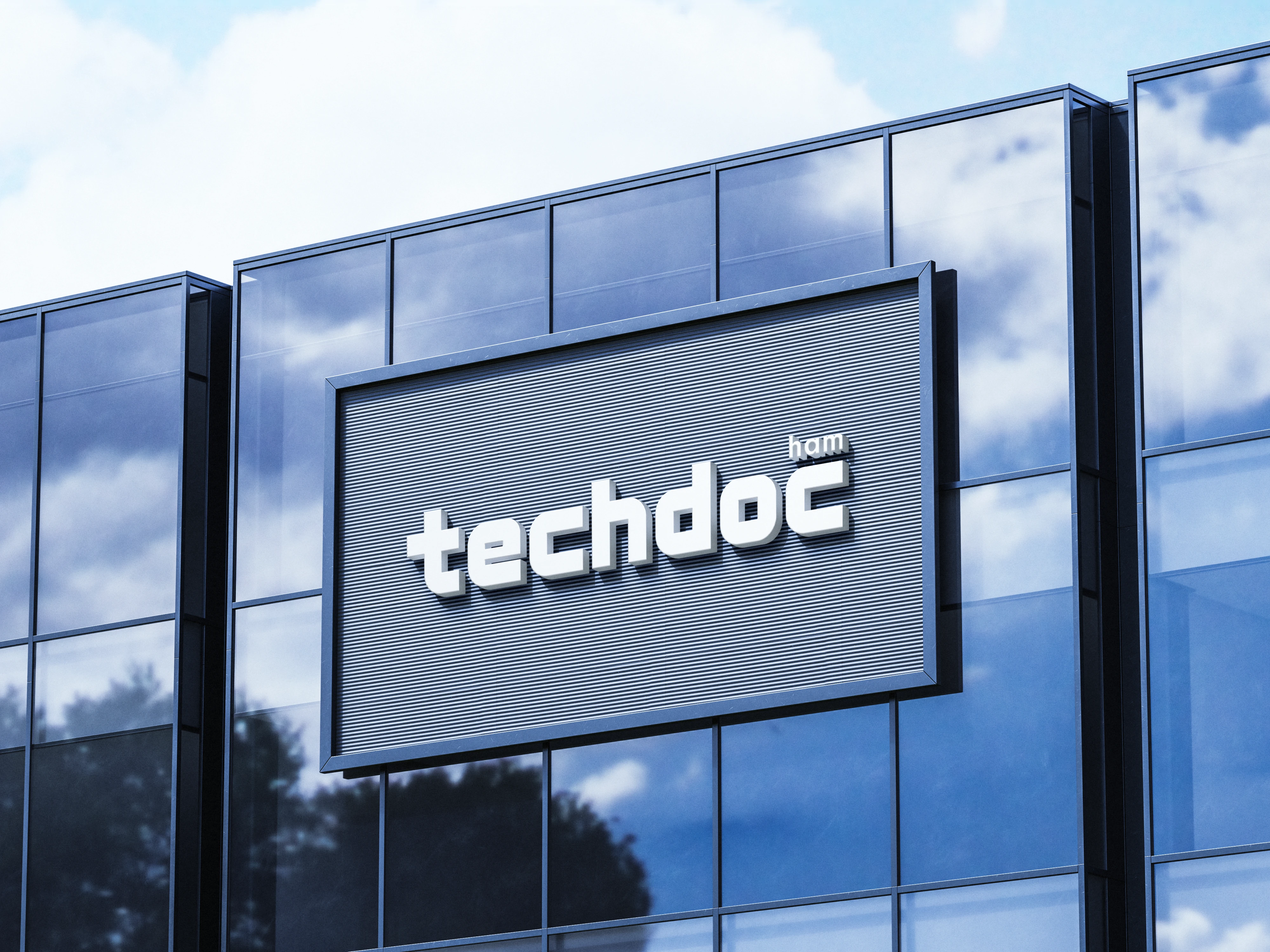
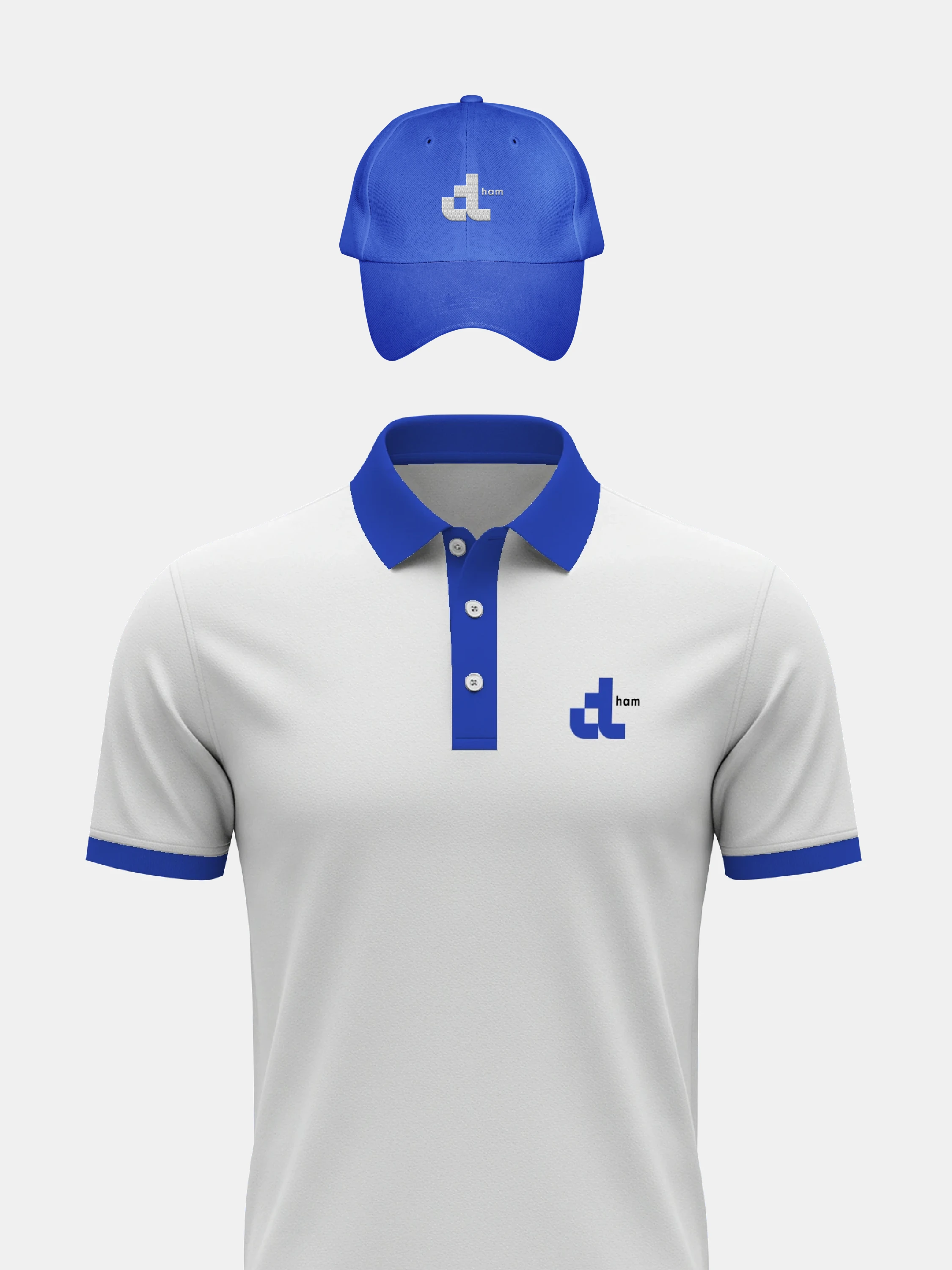
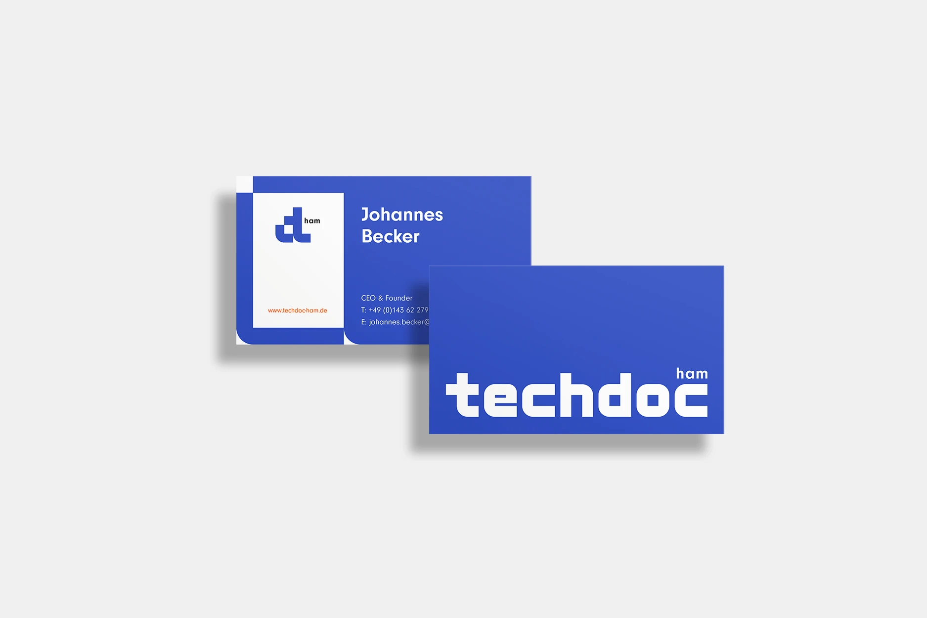
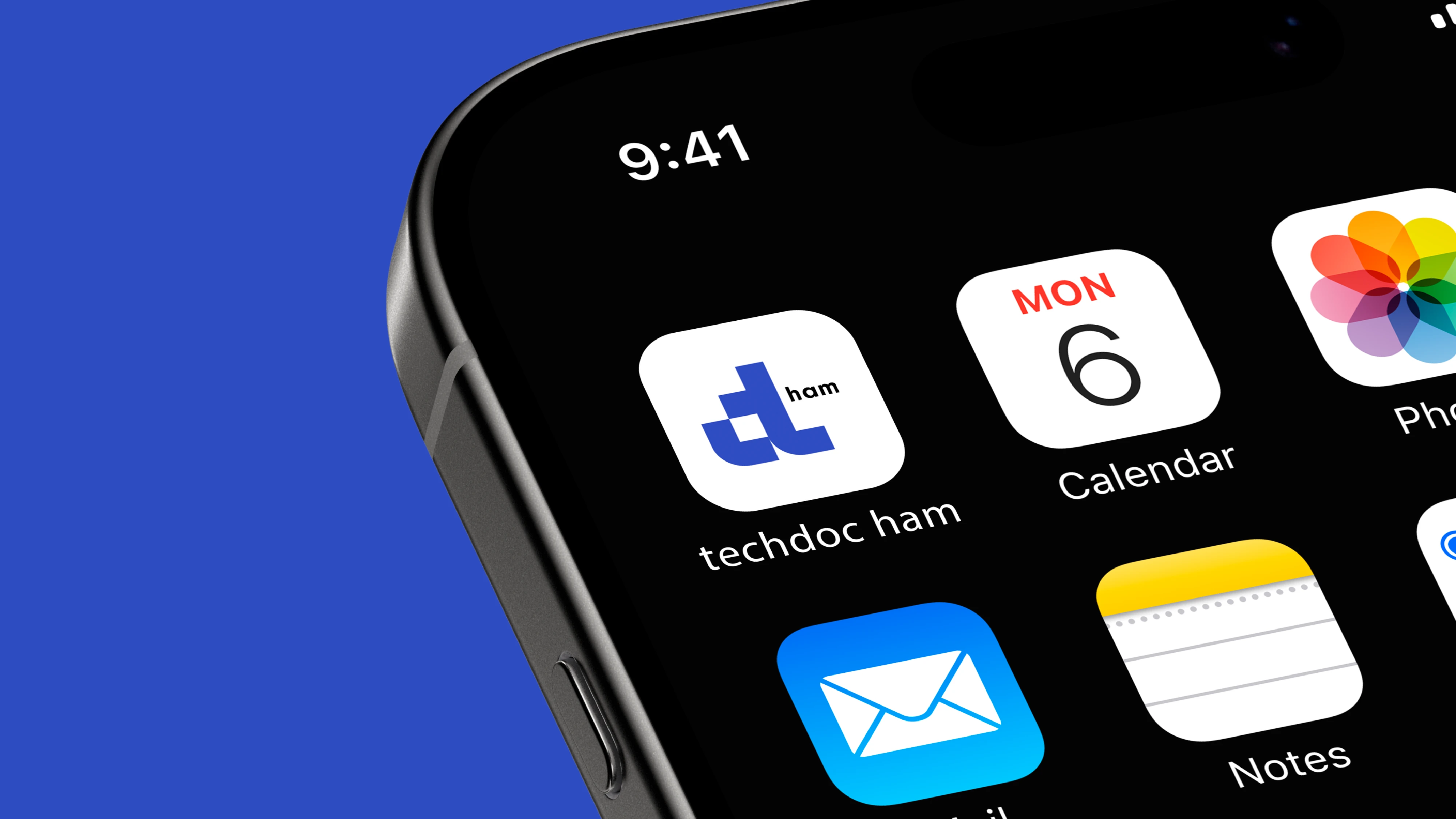
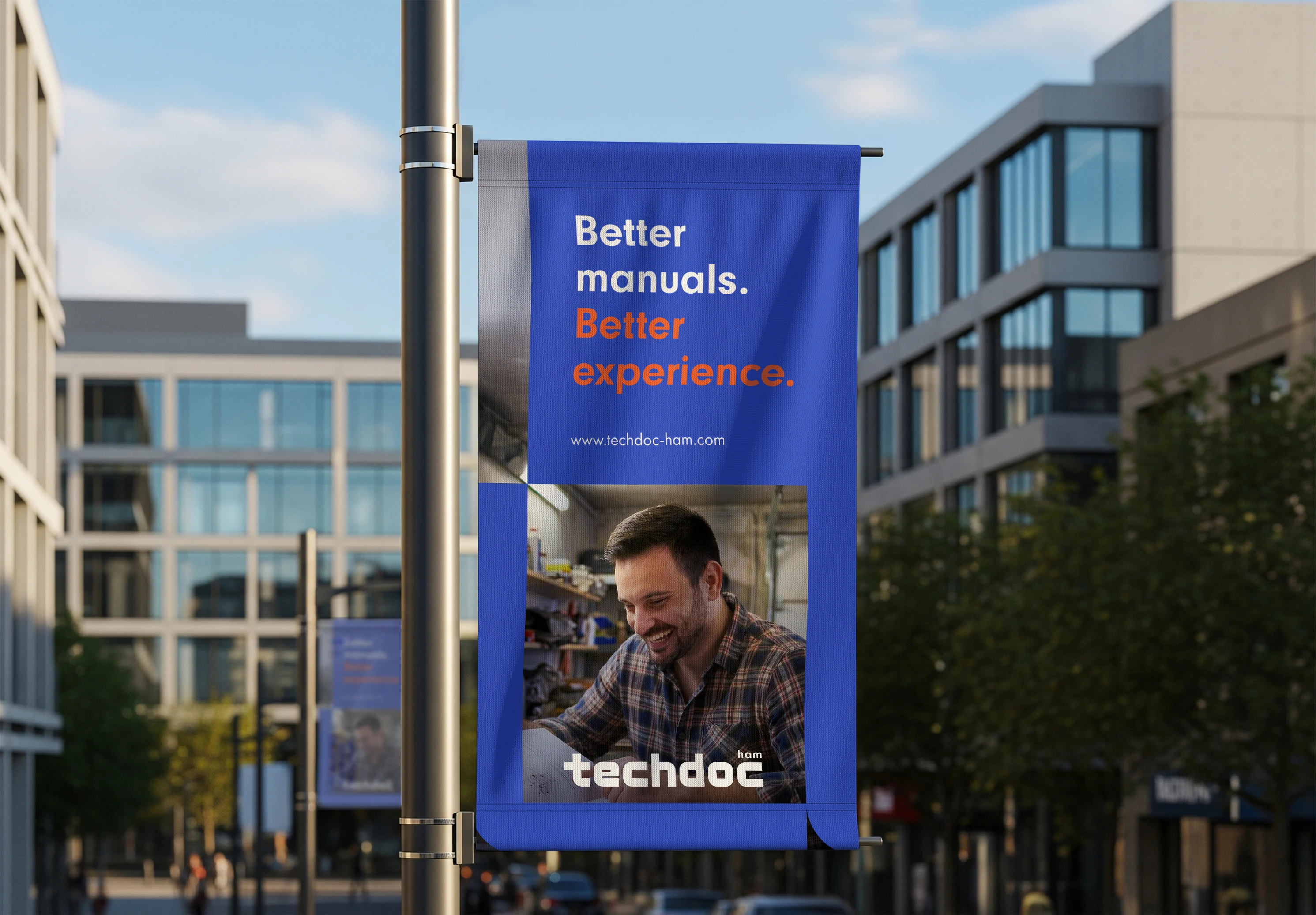
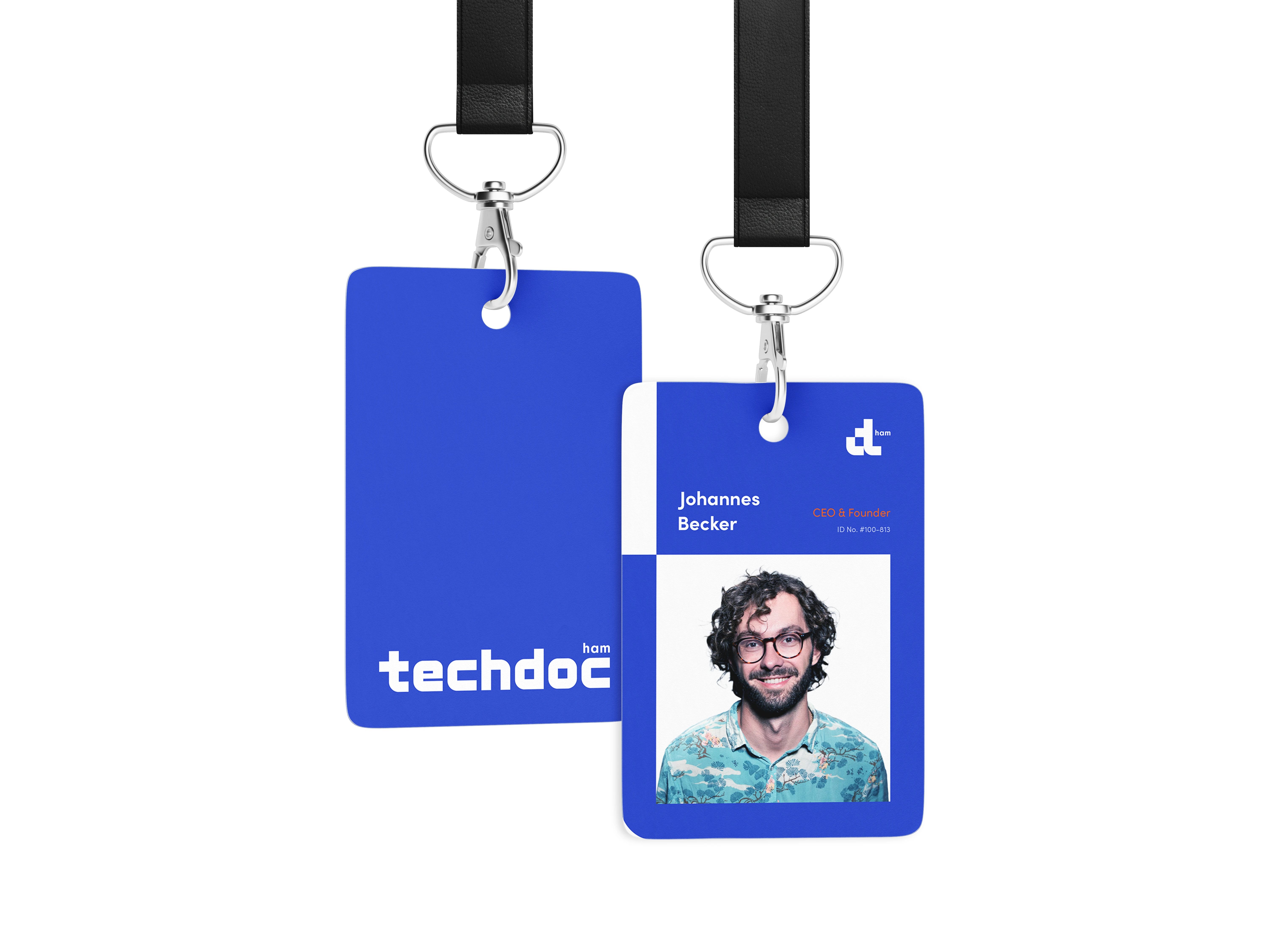
To strengthen their visual representation, I developed a refreshed logo that better embodies the company’s precision, professionalism, and evolving strategic focus. The new mark balances clarity and modernity, reinforcing Techdoc Ham’s heritage in technical excellence while supporting its positioning as a trusted partner in documentation and compliance services.